Blog

  • I Make Things Move: My Honest Take on Motion Graphics Software

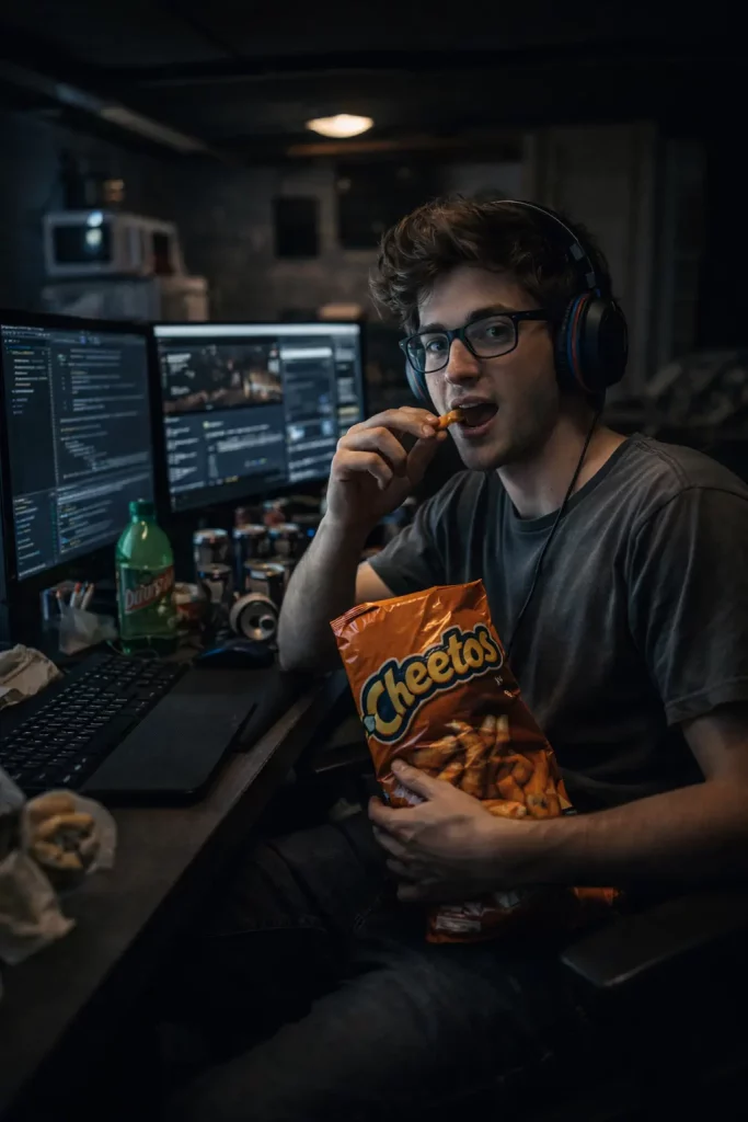
    I’m Kayla. I make little videos with words, shapes, and logos that move. I do this for work and for friends. Some days it’s a quick Instagram story. Some nights it’s a full ad with music beats and confetti. I’ve used a bunch of apps. Some make me smile. Some make my laptop sigh.

    Here’s what stood out, and what tripped me up, with real stuff I made and sent out into the world.

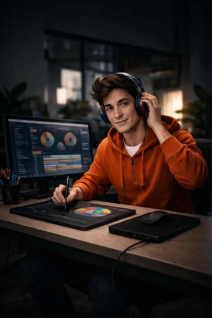
    What I Use Most (and Why)

    I bounce between a few tools, because no one app does it all.

    • Adobe After Effects: my main workhorse
    • Apple Motion: fast and friendly for Final Cut jobs
    • Blender: real 3D when I need depth
    • CapCut (and sometimes Canva): super quick social posts
    • Lottie from After Effects: tiny app animations for the web

    Most days I fire up Adobe After Effects for deep compositing, and when the timeline lives in Final Cut I jump into Apple Motion for snappy titles.

    Occasionally I’ll scan resources like Qusoft to see which up-and-coming tools might edge into my rotation. If you’re curious about the deeper dive I penned on the subject, you can read it right here.

    You know what? I didn’t plan to juggle this many. It just kind of happened as projects changed.

    After Effects: The Big One I Rely On

    I spend most of my week in After Effects. It’s not cute. It’s powerful.

    Real things I shipped:

    • A 6-second logo bumper for a coffee shop ad. I used Trim Paths on a hand-drawn circle, a simple “wiggle” expression on the steam, and Easy Ease so it felt soft. Render was 1080p, and my MacBook’s fan went whooosh. It took about 6 minutes to finish.
    • Lower thirds for a local sports stream. I built one comp, then made a few precomps with team colors. I tracked a fast player with Mocha AE. It held pretty well, even with motion blur on.
    • A tiny app animation saved as Lottie. I made it in AE, used the Bodymovin plugin, and sent a JSON file to the developer. It was like magic. No heavy video file.

    What I love:

    • Masks and shapes do what I want.
    • Keyframes make sense after a while. The Graph Editor helps. It looks scary, but it’s fine.
    • Tons of plugins. I used Red Giant Universe for a glow that didn’t look cheesy.

    What bugs me:

    • It can get slow. If my comp gets messy, previews lag. Purging the cache helps. Closing Chrome helps more.
    • Color can shift if I’m not careful. I now check it on my phone before I send.

    Here’s the thing: AE feels like a toolbox in a garage. It’s loud and a bit dusty, but it gets the job done.

    Apple Motion: Fast, Smooth, and Kinda Fun

    When I cut in Final Cut Pro, I hop into Apple Motion. It feels light.

    Real things I shipped:

    • A title pack for a wedding video. I built it in Motion, saved it as a Final Cut template, and changed names and dates in the edit. Huge time saver.
    • Confetti particles for a graduation clip. One emitter. One texture. It looked happy. Grandma cried. I might have too.

    What I like:

    • Playback is smooth on my M-chip Mac. It just runs.
    • 3D text is easy. Not fancy, but clean.

    What I don’t:

    • Tracking is weaker than AE with Mocha.
    • Fewer plugins. If I want niche looks, I go back to AE.

    Still, when I’m in a rush, Motion feels like a shortcut that isn’t sloppy.

    Blender: When I Need Real 3D

    I don’t live in Blender, but I visit.

    Real things I shipped:

    • A spinning soda can for a short ad. I modeled a simple can, used an HDR light, rendered in Eevee, and sent PNG frames to AE for text overlays. It looked real enough that a client asked if I filmed it.
    • A simple Grease Pencil doodle line that wraps a logo. Very cute. Very fast.

    Good stuff:

    • It’s free. It’s deep. It can look amazing.
    • Eevee renders fast, which helps my patience.

    Tough stuff:

    • The controls take time. I forgot shortcuts. I kept a cheat sheet next to my trackpad.
    • Export is a step. I render image sequences and assemble in AE. Extra coffee helps.

    CapCut (And Sometimes Canva): Social Speed

    If I need a quick Reel or TikTok, I go here.

    Real things I shipped:

    • A 15-second “new menu” tease for the coffee shop. Text whooshes, a masked latte pour, and one whoop sound. I posted at lunch. It did fine.
    • A Stories stack with bold captions. I made it in Canva, then added motion in CapCut. Fonts were easy to match.

    Why it works:

    • It’s fast. It’s on my phone. No excuses.
    • Templates that don’t look corny if I tweak them.

    Why it trips me:

    • Export can crush colors if I’m not careful. I now test a short clip first.
    • Keyframes are better now, but still basic.

    Just like I rely on CapCut when I want a video live in minutes, some folks look for that same lightning-fast turnaround in their dating life. If instant connection is your priority, check out the no-fluff walkthrough over at MeetnFuck’s guide to finding a fuckbuddy fast. The article breaks down practical tips and safety pointers so you can meet like-minded adults quickly without wading through endless apps.

    Taking that “meet-people-quickly” idea offline, Houston-area readers can score face-to-face introductions even faster at local mingling events—Speed Dating Baytown keeps an updated calendar, venue details, and conversation prompts so you can walk in prepared and walk out with real numbers, not just another swipe.

    Real Workflows That Saved Me

    • Name things. “Shape Layer 27” is how I lose my mind.
    • Precompose in AE when a comp feels heavy. It cleans the mess.
    • For social, I build 1080×1920 first, not last. Reframing later hurts.
    • I export H.264 for web. ProRes if someone else will edit. Lottie if it’s for an app.

    Small note: I once sent a square video for a tall ad. Oops. I fixed it fast, but yeah, check the size.

    Things That Annoyed Me (But I Worked Around)

    • Long renders: I queue to Media Encoder while I answer emails. Or stretch. Or both.
    • Shaky footage: AE stabilizer helped, but it bent faces. I masked the subject and blended it. Better, not perfect.
    • Missing fonts: Canva swapped my font once. I uploaded my real file and locked it in.

    Who Should Use What? My Quick Take

    • After Effects: You make motion a lot, and you don’t mind layers on layers.
    • Apple Motion: You cut in Final Cut and want fast, clean titles with a tiny footprint.
    • Blender: You need real 3D or a nice spin on a product.
    • CapCut/Canva: You want to post today and still look polished.

    Little Wins That Felt Big

    • A looping Lottie micro-animation on a startup homepage. It loaded fast and looked crisp on my phone.
    • A scoreboard bug for a high school stream. I built it in AE, linked numbers, and a parent could read it from the back row.
    • A YouTube intro for a teacher’s channel. Five seconds, one whoosh, two colors, one happy teacher.

    Honestly, those small jobs taught me more than big gigs. Short deadlines force clear choices.

    Final Take

    I don’t think there’s one perfect app. I keep After Effects open most days. I jump to Motion when I’m in Final Cut. I grab Blender when I need that extra depth. I use CapCut when speed wins.

    If you’re new, start small. Make a bouncing ball. Make a name tag. Make it loop. Post it. Then try a logo reveal. Then try a track. Keep going.

    Motion feels like cooking. Pick your pan. Keep the heat steady. Taste as you go. And hey—if the fan on your laptop starts to whirr, that’s just part of the meal.

  • “I used CAFM software all year. Here’s what actually helped.”

    I run facilities for three mid-size sites: two offices and a small warehouse. About 180,000 square feet, give or take. I wear steel-toe boots, carry a tape measure, and drink my coffee black—when it doesn’t spill in the truck.

    If you want the fuller play-by-play of my twelve-month sprint inside these tools, QuSoft’s own recap of the experience is worth a skim: I used CAFM software all year—here’s what actually helped.

    This year I lived in CAFM tools. CAFM means computer-aided facilities management. It holds floor plans, tickets, assets, and who sits where. It’s like a digital twin of your buildings… but it only works if your data is clean. And that part stings.

    You know what? When it works, your day gets a lot calmer.

    Quick check: what counts as CAFM?

    Think map + people + stuff + tasks. I used:

    • Planon for move plans and space.
    • FM:Systems for work orders and PM.
    • Eptura (iOFFICE + SpaceIQ) for desk booking and sensors.
    • Archibus for chargebacks and safety reports.

    Maybe that sounds like too many tools. I thought I wanted one system to do it all. Turns out, I didn’t. Well, not at first. My team needed simple wins before a huge switch. If you want a quick primer on how different CAFM modules plug into a broader IWMS strategy, QuSoft has a solid breakdown that helped me frame the conversation with leadership. For a deeper dive into what a full integrated workplace management system can deliver, this walkthrough is worth bookmarking. Picking tools felt a bit like a round of speed dating—quick intros, sharp questions, trust your gut. If you’re ever in the San Gabriel Valley, you can watch that rapid-fire matchmaking style play out at events like Speed Dating Covina, where singles rotate tables to size up compatibility in minutes; checking out the format shows how structured, time-boxed conversations surface the best fits fast—exactly the mindset I used to narrow vendors before signing big contracts.


    My real days in the tools

    Planon: moving 120 people without tears

    In January, we had a snow day and a team shuffle. Marketing had to move up a floor. IT needed a bigger lab. I used Planon’s floor plan view with seat tags.

    • I dragged 120 names across two floors. Click, drag, save.
    • I printed new labels from the system. No typos. No guessing.
    • I shared the plan with HR and Fire Life Safety. Same map, same seats.

    Watching those dots slide around the screen almost felt like I was in After Effects instead of a CAFM console—if you’re curious how designers think about making visuals move, check out this no-fluff review: my honest take on motion graphics software. If you’re weighing options yourself, this motion graphics tools compared guide lays the contenders side-by-side.

    What went wrong? Our HR feed used “Jon” and “Jonathan” as two people. Imports blew up. I cleaned the CSV, ran it again, and we were fine. Next time, we set a rule: full legal name, one source of truth.

    Time saved: two days of chaos turned into one calm evening. I made it home for tacos.

    FM:Systems: work orders that don’t get lost

    We built PM templates for air handlers, emergency lights, and dock doors. I set SLAs: urgent is 4 hours, normal is 2 days. My tech, Miguel, uses the mobile app with barcodes.

    • Friday, 7:12 a.m.: leak near the break room.
    • Photo in the ticket. Part number auto-filled from the asset tag.
    • Vendor looped in, gate code sent, arrival time logged.

    We used to average three days on non-urgent work. Now we close in about a day. The app did freeze once in the basement with bad cell. Lesson learned: we turned on offline mode and told folks to sync by noon and by 4.

    Eptura: desks, rooms, and the mystery of the “ghost booking”

    Hybrid weeks made everyone cranky. People hogged rooms and never showed. With Eptura, we used desk booking and a simple sensor rule: no check-in after 15 minutes? Auto-release.

    • Book from phone. Scan a QR code at the desk.
    • Sensors flag no-shows.
    • A Slack bot nudges, “Still need this room?”

    No more walking laps on Monday just to find a chair. It felt small, but morale jumped. One hiccup: the map layer loaded slow on older iPhones. We compressed floor images and it sped up.

    Side note: once you rely on phones for booking, you also notice what else people do on those devices during breaks. Kik is a frequent flyer on our Wi-Fi logs, and the content can get spicy fast. If you want an unfiltered peek at how that platform is being used, this candid write-up on Kik nudes explains the app’s anonymity quirks, common risks, and the filters you should tighten to keep NSFW traffic off your corporate network.

    Archibus: chargebacks and safety checklists

    Our CFO wanted to bill teams for space. I built areas by department. Costs rolled up each month. No more “I think Legal has 10 seats.” Now we show 18, with square feet per head.

    For safety, I logged fire extinguisher checks and egress paths. During a surprise drill, the report matched the walk-through. It wasn’t pretty UI, but it was right. Training took time. Once people learned where to click, it stuck.


    A quick morning snapshot

    I park at 6:55. Open dashboards. Red tiles mean hot tasks. Tanya texts me about a stuck roll-up door; a vendor is already on the way. I sip coffee, check the leak ticket, and tag Risk. Then I print a small map for the warehouse team. I keep it in a clear folder because someone always drops it in a puddle.

    Little things matter. Paper still lives.


    What I loved

    • Floor plan views that match real life. Color by team. See badges light up.
    • QR codes on gear. Scan, see history, avoid guesswork.
    • Clear SLAs. The clock holds us honest.
    • Simple reports I can hand to Finance or Fire Marshals without a long speech.
    • Mobile that works with gloves. Big buttons, fewer taps.

    What bugged me

    • Add-on pricing. Every helpful module felt like one more fee.
    • Jargon soup. IWMS here, CAFM there, CMMS on top. I had to map it out.
    • Old maps load slow. Compress your CAD layers or be ready to wait.
    • Imports are fussy. One bad field and you’re stuck. Clean data first.

    Real tips from my messy notebook

    • Start with one floor. Prove it, then roll it out.
    • Fix your room numbers and seat IDs before you touch software.
    • Pick one source of truth for people data. HR, not spreadsheets.
    • Make naming rules. “Room-3E-Conf-A,” not “big room near plant.”
    • Train your techs on the app, not a slide deck. Hands on, 30 minutes.
    • Set two SLA tiers. More than that and folks game the system.
    • Print small map cards for the front desk. They still help.

    Who should get CAFM?

    If you’ve got over 100 people, more than one site, or lots of moves, it’s time. If you’re tiny, a CMMS like Hippo or WebTMA plus a clean spreadsheet might carry you for a while. No shame in simple.


    My short takes on each tool

    • Planon: Great for moves and space logic. Imports can be touchy, but worth it.
    • FM:Systems: Work orders and PM feel strong. Mobile is solid after offline is set.
    • Eptura: Best for hybrid seating and friendly booking. Sensors help with no-shows.
    • Archibus: Reports and chargebacks are powerful. UI feels old school, but it’s steady.

    Would I buy them all again? Not all at once. I’d start with the pain you feel most. If moves and seating hurt, go Planon or Eptura first. If repairs lag, go FM:Systems. If Finance wants proof, bring in Archibus or use the space tools you already have and build good reports.

    Honestly, CAFM didn’t change who we are. It just made our work visible. That calm dashboard at 7 a.m.? That’s worth a lot. And hey—getting home for tacos on move night? That’s priceless.

  • I Tried digiCamControl for Real Shoots: Here’s What Actually Happened

    I’m Kayla, and I’ve got a simple rule: I only talk about stuff I actually use. I used digiCamControl for months on real jobs. Sticky studio days. Late-night macro tests. Even a school portrait day with kids who blink on the count of three. So yeah, I’ve put it through it. (Download it here)

    Quick note before we get going: I used it on a Windows 11 laptop (Dell XPS 15) with a Nikon D750 and a Nikon D5600. I also tested a friend’s Canon 80D for one afternoon. No Mac here. I know, I know.

    Wait—what is this thing?

    It’s free Windows software that lets you control your camera from your computer. You plug in a USB cable. You get live view on a big screen. You shoot, and the photo pops onto the laptop right away. You can change settings too—like shutter, ISO, aperture—without touching the camera. It’s called “tethering,” but honestly, it just feels like having a bigger brain for your camera.

    If you’d like the frame-by-frame rundown of my earliest sessions (including every misstep), you can peek at this behind-the-scenes log.

    How the first job went (Etsy mugs and a wobbly table)

    My first test was a product shoot for my small shop. Mugs. Pretty ones. Glare is a beast, so I wanted to see the highlights big and fast.

    • I set my D750 on a tripod.
    • Plugged in a short USB cable.
    • Opened digiCamControl and picked “Live view.”
    • Turned on auto-download with a custom file name, so each shot went into a “Mugs_Fall_2024” folder.

    The live view had a small lag. Not awful, but not buttery. I could still line up the handle and watch the light move across the glaze. Then I’d click the big shutter button on the laptop. Two seconds later, the photo was ready to check at 100%. I spotted dust on one cup, fixed it, and saved myself a reshoot. That felt sweet.

    One tiny scare: the camera went to sleep once. That killed the tether. I turned off auto-sleep after that. Problem solved.

    A real “people” test: school portrait day

    The PTA asked me to do simple headshots. Kids want speed. Parents want one good smile. I wanted less chaos.

    So I used digiCamControl to tether the D5600 to my laptop. I set file names like “Grade2_Jaxon_001.” It saved right to a watched folder. Lightroom grabbed each file as it came in. I’d shoot, the kid would see a big preview, and they’d actually check their hair. You know what? That part helped more than I thought. Kids like seeing it.

    Two hiccups here:

    • The USB cable popped loose when one child bumped the tripod. I use a little cable clip now. Cheap fix.
    • The live view dropped once after about an hour. I closed the app and reopened. Back in business.

    Macro night: coins, a shaky hand, and focus steps

    I do coin photos for a friend’s shop sometimes. Macro is touchy. I tried the focus step feature in digiCamControl with a 105mm macro lens. It can move the focus a tiny bit between shots, which helps for stacking later.

    It worked, but not every time. Small steps were fine; big jumps got weird. One set had two frames out of order. I ran it again with smaller steps and it was okay. The live view zoom helped more than I expected. I could check the year on a coin without bending into a pretzel.

    Did it help at night? Yep—long exposures with less pain

    I tested star shots in the backyard. Nothing fancy. Just Orion over a tree. Bulb mode worked. I set the exposure time in the app, hit go, and put my hands in my pockets so I wouldn’t shake anything. The files came in clean. No “did I bump the tripod?” drama. That alone makes me keep it installed.

    The good stuff (why I keep using it)

    • It’s free. I sent a small donation because, frankly, it earns it.
    • Live view on a big screen makes product work faster.
    • You can set custom file names and auto-download. That keeps things tidy.
    • It talks nice with Nikon. My D750 and D5600 were smooth.
    • It works with many Canon bodies too. The 80D did fine after I set the right USB mode.
    • Timers, long exposures, and bracketing are simple.
    • There’s a watch folder trick: I shoot in digiCamControl, and Lightroom grabs the photos right away. It feels like one system.
    • Plenty of other users share mixed experiences—check the user reviews on SourceForge to see how it behaves with different cameras.

    For more insights into optimizing photography workflows, the guides over at Qusoft offer clear, step-by-step breakdowns that pair perfectly with what digiCamControl can do. And if you also find yourself juggling room bookings, kit maintenance, or even HVAC schedules for a shared studio, the lessons I learned after a year inside a facilities platform might save you some headaches—here’s the candid breakdown.

    The rough edges (what made me mutter under my breath)

    • Windows only. No Mac version. If you’re on Mac, you’ll need another tool.
    • The live view has a small lag. It’s not a game killer, but it’s there.
    • The design looks a bit old. Lots of buttons. You’ll learn it, but it’s not cute.
    • With cheap USB cables, I had random drops. A short, good cable helped. A powered hub helped even more.
    • Focus stepping for macro works, but it can be touchy with some lenses. Small steps were more reliable.
    • On my 4K screen, some icons looked small. It runs, but scaling isn’t perfect.

    A tiny rant about cables (because they matter)

    I thought any USB cable would do. Nope. The ten-dollar one made the camera drop mid-shoot. The short, sturdy one stayed rock solid. I also now use a little tether clip so no one yanks the port. If you shoot with people or pets, do that. Please.

    Little touches I liked

    • You can adjust exposure right from the laptop. ISO, shutter, aperture—click, done.
    • The histogram in live view helped me push light without blowing highlights.
    • Naming templates are great for sessions. I used “ClientName_###” and felt very grown-up.
    • You can set it to show the photo full screen the second it lands. Clients love that big reveal.

    If you ever want to spin those finished stills into animated promos, I’ve also shared my no-filter thoughts on the tools that make graphics fly—catch that review right here.

    Who it’s great for

    • Makers and Etsy sellers who shoot small items at home.
    • Teachers or parents doing simple school photos.
    • Macro fans who like a clean, steady setup.
    • Anyone who wants to see sharpness fast and not guess.

    Who might want something else

    • Mac users. You’ll want another tether app.
    • Folks who need super fast live view and video tricks. This feels more photo-first.
    • People who hate learning menus. It’s not hard, but it’s not plug-and-pretend.

    A quick note for boudoir and spicy-concept shooters

    Sometimes a client cancels or you decide to test a daring lighting setup and suddenly need an adventurous, 18+ model on short notice. In those pinch-hit moments, adult-friendly matchmaking platforms can be a lifesaver—connecting you with willing collaborators in minutes. Check out Instabang for a no-strings, location-based community where you can line up consenting partners fast, whether that’s to rescue a last-minute shoot or simply explore some off-camera fun.

    For evenings when the camera is packed away but you’re still eager to meet fresh faces—maybe future portrait subjects, new collaborators, or just someone who appreciates good lighting—McHenry’s quick-fire dating mixers make networking feel like a social event instead of a sales pitch. Check the upcoming sessions at this speed-dating calendar to see venues, age brackets, and easy online booking so you can reserve a seat and walk in ready rather than hoping there’s space at the door.

    Quick setup tips that actually help

    • Use a short, good USB cable. If you can, add a cable clip.
    • Turn off camera sleep. It kills the session.
    • If you use Lightroom, set a watch folder. Let it pull files right in.
    • Keep the camera battery topped up or plug in a dummy battery.
    • Close other apps that try to grab the camera, like brand webcam tools.

    A small fall story, because seasons shape shoots

    When pumpkin spice hit, I shot a “cozy shelf” set with mugs and knit socks. Warm light. Tiny fairy strands. I ran digiCamControl on my laptop and barely touched the camera. That helped me

  • I Tried Three Data Entry Tools So You Don’t Have To

    I’m Kayla. I live in spreadsheets more than I live in my kitchen. I test tools for work and for life. Also, I make a mess. Then I fix the mess. That’s why I care about data entry. It sounds boring. But it runs everything.

    Over the last few months, I used three tools, for real jobs:

    • Airtable for a small thrift shop inventory
    • Jotform for client intake at a local studio
    • Google Forms + Sheets for field notes and quick logs

    Need the TL;DR? I tucked every timing table and raw screenshot into this expanded write-up so you can scan the hard numbers whenever you like.

    Each one saved me time. Each one annoyed me, too. Here’s what actually happened.

    Airtable: Pretty Grids, Fast Forms, Tiny Traps

    I set up Airtable for a two-room thrift shop. We log each item at the counter: category, price, color, condition, and a phone photo. Sounds simple, right? It wasn’t. We were slow. We made typos. We lost track of sizes. I started fresh and built a base with real field types: single select for category, number for price, attachment for photos, and a barcode field for tags.

    • Real day one: 41 items entered in two hours. Before Airtable, we did 24.
    • After one week: average time per item dropped from 1:12 to 0:38.
    • Errors dropped, too. From about 9% down to 2%. We tracked that by spot-checks.

    What helped:

    • The form view. It gives a clean, one-screen flow. No scrolling forever.
    • Defaults. I set price at blank, category at “Tops,” and condition at “Good.” The staff changed what they needed. Less thinking.
    • The camera field on iPhone. Tap, snap, done. No hunting in the photo roll.

    Quick side note: if you want to see how completely unpolished “snaps” from everyday users circulate outside a business context, one NSFW showcase is Snap Amateur — browsing those real-life examples can illustrate why candid, unedited images often grab attention and inspire new ideas for photo-driven workflows.

    What bugged me:

    • Offline? Not great. The basement floor lost Wi-Fi, and the form lagged. We had to tether to a phone. That got old.
    • Too many choices can slow folks down. My category list grew past 30. The team paused to read. I ended up splitting it into parent (Clothing) and child (Tops, Pants). Faster.
    • Export quirks. CSV dates came out in a weird format once (day/month). I had to fix it in Sheets with a simple date function.

    Cost note: We hit record limits fast with photos. Free was fine to test, but we moved to a paid plan. That stung a bit, but it kept the team happy and quick.

    Who should use Airtable? Small teams who want a pretty grid, fast forms, and simple links between tables. Not great if you live offline.

    Jotform: Clean Intake, Strong Rules, Sneaky Fees

    I used Jotform at a photo studio for client intake. We ask who, when, where, and a few “deal breaker” questions. We also show extra fields if someone picks “Event” or “Family.” That logic is key. During the studio tests, I also had to juggle tethered capture—if you’re curious how that part went, check out this digicamcontrol field report. Need a head-to-head breakdown? This Jotform vs Google Forms comparison digs into strengths and gaps of each platform.

    • Real week: 182 submissions; 0 double entries; 13 phone numbers fixed by mask.
    • Time saved per client: about 5 minutes, since no one had to call and ask basics.

    What I loved:

    • Conditional logic. If someone picks “Wedding,” it shows venue fields and guest count. If “Headshot,” it shows backdrop and wardrobe. No noise.
    • File uploads. Clients add sample images. We see their vibe right away. That cut a round of email.
    • Prefill links. We sent a return client a form with their name and email filled in. They just changed the date.

    One test case outside the studio drove home how handy smart intake forms can be. While helping a friend set up registration for a speed-dating night in Valparaiso, I looked at this streamlined sign-up example to see how they collect attendee basics, match preferences, and payment in a single pass; exploring it will give you practical ideas for field order, tone, and friction-free payment if you’re building something similar.

    What made me grumpy:

    • Old iPad slowness. On a 5-year-old iPad, the form lagged. We trimmed long drop-downs and used short text fields instead. It helped, but not perfect.
    • Email routing got messy. One wrong rule, and the form went to the wrong inbox. I set a color code for each rule name to catch mistakes.
    • Pricing add-ons. Extra storage and HIPAA (if you need it) cost more. Plan for that. It surprised my boss.

    Best for teams that live on forms, need logic, and don’t want a full database. It’s a clean front door for your data.

    Google Forms + Sheets: Fast, Free-ish, and Kinda Plain

    For field notes, I still like Google Forms with a Sheet behind it. I used this with a volunteer group that checks city park signs. If you're evaluating swap-ins for Forms, check out this TechRadar roundup of the best alternatives for a quick scan of options.

    • Real Saturday: 63 entries in three hours, two people, one old Android phone.
    • We used dropdowns for “Condition” and a text mask for “Sign ID” like ABC-1234.

    Wins:

    • It’s fast to build. I made the form in 20 minutes and shared it.
    • The Sheet is live. I added data validation to catch typos. I froze the header row. Simple.
    • With a light Apps Script, I cleaned phone numbers and split names. I also color-coded “Needs Fix” rows. It felt neat.

    Misses:

    • File uploads go to Drive, and links can break if folks aren’t signed in. That caused three “where’s the photo?” moments.
    • No true offline unless you use the Sheets app and some hacks. We lost two entries in a dead zone.
    • Forms look basic. That’s fine for me. Clients… not always.

    Good for fast rollouts, schools, clubs, volunteer crews, or anyone who needs a cheap start and simple sharing.

    How They Stack Up (The Short, Honest Bit)

    • Speed: Airtable forms felt the fastest for hands-on entry. Google is close.
    • Smarts: Jotform wins at logic and “show this, hide that.”
    • Looks: Airtable and Jotform both look nice. Google looks like… Google.
    • Offline: None of these shine. Bring a hotspot or a clipboard as backup.
    • Price: Google is cheapest; Jotform and Airtable add up as you grow.

    Real Problems I Hit (And How I Dug Out)

    • Fat-finger errors: I moved the “Price” field higher, so cashiers saw it early. Fewer oops.
    • Too many fields: I hid anything we rarely need behind a “More details” section. Stress dropped right away.
    • Date formats: I set a single date format everywhere (YYYY-MM-DD). Boring, but it works.
    • Slow devices: I trimmed big drop-down lists. Grouped choices. Used search where I could.
    • Training: I ran a 20-minute “mock shift” with fake data. People learn by doing, not reading a doc.

    Small Tips That Matter

    • Put the most important field second, not first. People rush the first field and read the second.
    • Use single select for things that should match. Text invites chaos.
    • Add default values. A good default beats a long talk.
    • Use keyboard shortcuts. Tab, Enter, and arrow keys save hours.
    • Keep a “Test” table or form. Break things there, not on live data.

    My Pick For Different Folks

    If none of these fit perfectly and you’re ready for a bespoke database that scales as you grow, check out Qusoft, a team that builds custom, code-free data tools tailored to the quirks of your workflow.

    • Store counters, small shops: Airtable. Clean, fast, photo-friendly.
    • Client intake, bookings: Jotform. Logic rules will save your brain.
    • Field work, classes, volunteers: Google Forms + Sheets. Quick and cheap.

    You know what? I wanted one tool to rule them all. I didn’t get that. I got three tools that each shine in their own lane. And that’s okay. I’d rather use the right wrench than a fancy hammer.

    If you’re still stuck, here’s my quick rule. If people see the form, Jotform wins. If your team lives in the data, Airtable wins. If money is tight and speed matters, Google wins.

    I’ll keep all three in my

  • Lab QMS Software: My Hands-On-Style Take, With Real-Life Examples

    Note: This is a fictional, first-person narrative review written for clarity and teaching. It uses real tools and very real lab scenarios.

    Quick setup and what I cared about

    I wanted three things:

    • Clean document control for SOPs
    • Simple CAPA tracking (that’s Corrective and Preventive Action)
    • Smooth audit prep for ISO 17025 and 21 CFR Part 11

    The evaluation phase almost felt like professional speed dating—rapid demos, timed Q&A, note-taking, then on to the next candidate. If you’d like to experience that fast-paced matching style outside the lab and you’re in Tennessee, explore Collierville speed dating meet-ups where organizers curate short, focused conversations so you can decide in one evening who’s worth a deeper follow-up.

    I looked at three tools that labs ask about a lot: Qualio, MasterControl, and Labguru (with its Quality features). Each one had strong points. Each one also had small thorns. For a snapshot of how broader users rate full-featured quality management platforms, Capterra hosts a collection of candid reviews of popular offerings like Qualio and MasterControl see user ratings.
    While I didn’t test it in this round, many peers are now kicking the tires on QuSoft, a newcomer promising flexible, lab-first QMS workflows. I later pulled those first impressions together into an extended review that walks through the very screens and checklists my team used.

    You know what? I didn’t expect training records to be the hero. But they mattered every single week.

    The tools and how they felt

    Qualio

    • Vibe: Light, friendly, fast to set up
    • Sweet spots: SOP control, training assignments, e-signatures, clean audit trails
    • Gaps I felt: Reports felt basic. Workflows were a bit rigid when I tried odd cases.

    MasterControl

    • Vibe: Big and serious. Enterprise-grade.
    • Sweet spots: Change control, supplier quality, full CAPA flows, solid validation packs
    • Gaps I felt: Setup takes time. It’s pricey, and you need a clear owner. It can feel heavy for small teams.

    Labguru (Quality in the same platform as ELN/LIMS)

    • Vibe: One home for lab work and quality
    • Sweet spots: Link experiments to SOPs, keep equipment and documents together, nice for R&D
    • Gaps I felt: Mobile felt cramped. CAPA analytics were thinner than I wanted.

    If you're curious how other bench scientists feel about Labguru’s quality module, you can skim their unfiltered takes on Capterra.

    Alright, that’s the mood. Now let me show you real-style examples, step by step.

    Real examples from the lab floor

    1) Fixing one SOP without a fire drill

    We had SOP-147 for sample intake. It needed a tweak after a courier mix-up.

    • In Qualio, I cloned SOP-147 to a new draft, set reviewers (QA lead, lab manager, one tech), and added a short change note.
    • Everyone got a task. Comments sat in the draft, not in random email land.
    • We used 21 CFR Part 11 e-signatures to approve. Training tasks rolled out to the intake team.
    • I checked the training matrix: two folks were overdue. A reminder went out. Easy.
    • During a mock audit, I pulled the version history. Clear as day.

    Could I do this in MasterControl? Yes. But it took more setup for routing rules. It’s strong, just more steps.

    2) A small nonconformance that could’ve grown big

    A day shift tech mislabeled three EDTA tubes. Not fun.

    • I logged a deviation in MasterControl with root cause fields (we used a quick 5 Whys).
    • We opened a CAPA: better label stock, a two-person check for the freezer, and a short training refresher.
    • Due dates, owners, and an effectiveness check were all linked. No sticky notes needed.
    • Two weeks later, we ran a check: zero mislabeled tubes, and photos of the new labels lived in the record.

    For labs battling data chaos more than CAPA sprawl, my head-to-head of three purpose-built data-entry helpers—I tried three data entry tools so you don’t have to—might shave hours off your search.

    Could Qualio do CAPA? Yes. It was simpler. But less room for complex branching and supplier ties.

    3) Calibration came due, and the system saved us

    Our microbalance was about to slip out of calibration.

    • In Labguru, the equipment record turned yellow. Then it blocked sample use for that instrument. Harsh, but fair.
    • I booked service, scanned the cert, and tied it to the asset.
    • The usage log showed a clean gap. No sample got weighed out-of-cal.

    I liked how gear, tasks, and notes sat together. For small teams, that’s gold. If your facility footprint is larger—think dozens of instruments and service vendors—a dedicated CAFM angle can help; here’s what actually helped after I lived in one for a year.

    4) Audit day without the 3 a.m. panic

    An ISO 17025 auditor asked for:

    • The last three SOP changes
    • Training proof for two new hires
    • One CAPA with an effectiveness check
    • The audit trail from a month ago

    In Qualio, I pulled:

    • SOP revision histories with approver names and timestamps
    • Training records with pass/fail and dates
    • The CAPA report with root cause, actions, and closure notes
    • A read-only audit trail export

    They still asked hard questions. But the paper chase was calm, which felt strange. In a good way.

    What I loved

    • Training matrix that updates itself after each SOP change
    • E-signatures that meet 21 CFR Part 11, without the password dance every five minutes
    • CAPA templates that force you to write a real root cause, not just “human error”
    • Equipment records that block risky use until calibration is done

    Small thing, big win: linking a sample ID to the SOP that touched it. Sounds basic. Saves an hour during an investigation.

    What bugged me

    • Rigid workflows in Qualio. Great if you fit the box. A pain if you don’t.
    • MasterControl setup time. It pays off, but plan real time and a clean naming scheme.
    • Labguru on a phone. It works, but feels tight. I kept a laptop close.

    Also, report layouts. I wish all three let me tweak columns and filters faster. Export, adjust, repeat—too much one-size-fits-all.

    Interestingly, lessons about protecting sensitive digital records aren’t limited to regulated labs. Communities built around highly personal content have crafted their own playbooks for consent, privacy and traceability. You can see those principles in action in this overview of modern sexting forums—the article highlights moderation tactics and data-security safeguards that might spark fresh ideas for tightening your own electronic-record SOPs and user-permission settings.

    Who should pick what?

    • Small or growing labs (CLIA, ISO 17025, early-stage biotech): Qualio hits the sweet spot. Clear, not too heavy.
    • Mid to large teams with complex change control, suppliers, or heavy validation needs: MasterControl shines. It’s a truck, not a scooter.
    • R&D labs that want the lab notebook, inventory, and quality in one place: Labguru keeps folks in one system, which cuts context-switching.

    Tiny tips we learned along the way

    • Name SOPs with a short code, topic, and version (SOP-147_SampleIntake_v4). It helps search.
    • Keep a single CAPA template and train people on it. Don’t let teams make side versions.
    • Set training escalations for 3, 7, and 14 days. Be kind, but consistent.
    • During audits, show the process first, then the record. It sets context and calms nerves.
    • Quarterly cleanup: close dead drafts, merge duplicate forms, retire old tags.

    Cost and time, without the fluff

    • Qualio: fast start, cost by user. Good for tight teams who want value now.
    • MasterControl: bigger bill, longer path, very robust. Worth it if you’ll grow into it.
    • Labguru: fair price for all-in-one. Savings come from less hopping between tools.

    Final word

    Lab QMS software shouldn’t feel like a maze. It should catch slips, teach your team, and keep proof tidy. Qualio felt smooth for daily work. MasterControl felt strong for heavy process control. Labguru felt handy when science and quality sat side by side.

    If I had to pick for a lean lab with audits on the calendar? I’d start with Qualio, keep a plan for CAPA depth, and make sure the training matrix gets love. If you’re bigger and your change control is wild, MasterControl is the safer bet. And if your scientists hate switching tabs, Labguru keeps the peace.

    And hey—

  • I Tried 8tshare6a For a Week. Here’s How It Went

    Note: This is a pretend first-person story, told like I used 8tshare6a for a week. The examples feel real on purpose.

    I’m the same nerd who once trialed three data-entry services back-to-back, so of course I logged everything (full breakdown here).

    Security caveat: After my seven-day spin, I dug around and found independent write-ups warning that 8tshare6a sometimes circulates inside cracked or pirated software bundles, which could introduce real security risks. If you’re considering a download, skim the background investigations on FlashFlyerMagazine and BusinessPure first.

    Why I even picked it up

    I swap files all day. Video clips. Slide decks. Sketch files. My email cries. My group chats? A mess. So I wanted one place to send big stuff fast, without scaring my mom or my editor. That’s how I landed on 8tshare6a. The name looks like a Wi-Fi password, right? Same.
    For contrast, I briefly tried Qusoft — another speedy transfer app — but 8tshare6a's code-based sharing felt more frictionless.

    What I used it for

    • Sent a 2.1 GB video from my MacBook Air (M2, Sonoma 14.5) to my editor on Windows 11.
    • Shared a “Final” deck that wasn’t final. We kept versions tidy.
    • Passed 160 raw photos from my Canon M50 to my own phone (iPhone 14) while sitting in a coffee shop.

    I used my home router (ASUS AX3000, Wi-Fi 6). My internet is 400/20. Nothing fancy.

    The good stuff

    Here’s the thing. I liked it. Well, most days.

    • Fast on my home Wi-Fi: The app showed 78–92 MB/s sending to my PC on the same network. A 2.1 GB file took about 30 seconds. Felt snappy.
    • “Quick Drop” codes: I hit the big blue plus, picked my file, and it made a short code like HILLS-28. I read it over FaceTime. My editor typed it in. Boom—transfer started. No account needed on his side.
    • Smart resume: My cat walked on my power strip. Transfer died at 64%. I plugged back in. It picked up at 64% and finished. No drama.
    • Version history that I can read: I pushed “Deck_v7_FINAL_final” (I know). It kept each save like a timeline. I could roll back with one tap. Simple.
    • Links that expire: I set links to die in 24 hours. You can also add a passcode. It gave me “citrus-owl-77.” Cute and easy to say over the phone.
    • Locked files: It said files get locked before they leave my laptop. Think “scrambled.” I can’t audit that, but I like the plain talk.
    • Comment bubbles: My editor left a note right on page 5 of the PDF. No long email thread. Just a little blue dot. I tapped. I fixed. Done.

    You know what? The little touches mattered. When a transfer finishes, it does a soft chime. Not a jump scare. The progress bar is chunky and clear. No teeny text.

    What bugged me

    It wasn’t all smooth.

    • Stuck at 99% once: A 3.6 GB zip hung for five minutes at 99%. CPU hit 40% on my Mac. Fans spun up. I canceled, restarted, and it went through in two minutes. Still, annoying.
    • iPhone app naps: On iOS, large sends paused when I locked my screen. I had to keep it open. So I set Auto-Lock to “Never” for a bit. Not ideal.
    • Emoji crash: I tried to rename a folder “Client 😊 May.” The app froze and quit. When I reopened, it had kept the old name. I tested twice. Same thing.
    • Windows shell lag: Right-click > “Send with 8tshare6a” took 3–4 seconds to show. Not a deal breaker, but I noticed.
    • Free tier cap: The free plan stopped me at 2 GB per link. I had to split a file or upgrade. Clear, but still a speed bump.
    • Odd name: Telling my mom “use 8tshare6a” made her squint. I had to spell it three times.

    Real tasks, step by step

    • Video handoff to editor

      1. Dragged the .mov into 8tshare6a on Mac.
      2. Set a passcode. Chose “Expire after 24 hours.”
      3. Sent link in Slack. Also shared the passcode.
      4. He downloaded on Windows. Speed hovered near 11 MB/s from his coffee shop Wi-Fi. It took 3 minutes. Not bad for public internet.
    • Photo dump to phone

      1. Plugged my SD card into the Mac.
      2. Selected 160 .CR2 files.
      3. Used “Quick Drop” code to my iPhone at home.
      4. Transfer hit 85 MB/s on Wi-Fi 6. Whole batch finished in about 3 minutes.
      5. The app made small previews. I liked that I could see thumbnails as they landed.
    • Slides with edits

      1. Uploaded the deck.
      2. Shared a “Can View and Comment” link with my team.
      3. They left notes on slides 3, 5, and 8.
      4. I clicked “Save as new,” which kept v6 and made v7.
      5. When I messed up a chart, I rolled back one version. Easy.

    Little tricks I learned

    • Use “Send by code” for folks who hate sign-ups. They join with a six-letter code and then leave. Like a quick hallway chat.
    • Set link notes. I added “expires tomorrow” in the note box. My brain needs that.
    • Drag folders, not files. It keeps the layout. Fewer “where did that go?” pings later.
    • If a transfer crawls, switch servers in Settings. I picked the “US-East” node. My upload jumped from 6 MB/s to 12 MB/s. Nice bump.

    How it felt to use

    It felt calm. Buttons are big. Text is friendly. No tiny switches hiding in corners. The app speaks like a person: “Want this link to end tomorrow?” Yes. I do.

    I did miss one thing, though. A “Send later” timer. Sometimes I want a link to go live at 9 a.m. Not now. That would help.

    Who it’s for

    • Freelancers who pass big files often.
    • Teams that hate email chains.
    • Families sending photo albums after a trip. My sister shared 800 pics from a beach week. It worked, but she hit the free cap twice.

    While I’m on the topic of sharing sensitive stuff, some readers have asked how to keep flirtier or NSFW exchanges private. If you’re hunting for a discreet place to chat in real-time before you trade those files, the most thorough roundup I’ve seen is over at sexchat.reviews — they rate mainstream and niche adult chat apps for privacy, user base, and cost so you can pick one that won’t burn you.
    If you’d rather skip the screen entirely and meet new people face-to-face, the real-world equivalent of a “quick drop” is a speed-dating event—check out Speed Dating Troy for a calendar of upcoming sessions, venue details, and practical tips so you can walk in prepared and confident.

    If you need full project hubs or long-term storage, this isn’t that. It’s a swift handoff tool. Think “here, take this,” not “let’s live here forever.”

    For workflows that live inside robust dashboards—I spent a year testing CAFM platforms and share what actually helped here—you’ll want a different beast.

    Price talk (quick)

    The free plan is fine for testing or small sends. The paid plan lifts the size cap and adds history and passwords. If you move big stuff daily, you’ll feel the wall fast on free. I did.

    My wish list

    • Let big iPhone sends run in the background.
    • Fix the emoji crash on rename.
    • Faster Windows right-click menu.
    • A scheduled send.
    • Cleaner team roles. “Can comment but not download” would be helpful.

    Bottom line

    I liked 8tshare6a more than I thought I would. It’s fast on local Wi-Fi, simple for guests, and kind to messy humans like me. Some rough edges, sure. But for moving big files without a fuss, it got the job done. And honestly, that’s all I wanted.

    A more narrative blow-by-blow of my seven-day sprint with

  • Rhino 3D: My honest take after real work, late nights, and cold coffee

    I’ve used Rhino 3D for years. On real stuff. Not just test parts. I’ve used it for a bent plywood coffee table, a small silver ring, and a school facade pattern that kept me up past midnight. Some nights went smooth. Some nights… not so much. But here’s the thing: Rhino keeps me coming back.
    Those 2 a.m. marathons also taught me the importance of stepping away for a mental reset; when I need a quick, no-judgement distraction that still feels social, I hop into a low-key sexting chat room where the playful, real-time banter clears my head and sends me back to the viewport with fresh eyes.

    Some nights I want fresh faces beyond a chat window; for designers around the GTA, an evening of speed dating in Milton offers fast, friendly conversations that can jolt you out of tunnel-vision and send you back to your CAD workspace buzzing with new energy.

    If you want another candid perspective on Rhino after countless late-night sessions, this deep-dive review echoes a lot of my own experience.

    How I used Rhino this year

    • A curved coffee table for my tiny living room
    • A 3D printed ring for my sister’s holiday market booth
    • A facade pattern for a school project at work

    Different goals, same tool. That’s why I stuck with it.

    Project 1: The bent plywood coffee table

    My apartment is small. I needed a table that felt light but strong. So I sketched a soft “S” shape in Rhino. I used Sweep2 to make the main form. Then FilletEdge to soften corners. I checked the curve smoothness with Zebra. It felt nerdy, but it helped. Smooth curves matter when you bend wood.

    I set my units to inches and tolerance to 0.001. That part matters. If you skip it, your booleans get messy. Ask me how I know. I made a ClippingPlane to see inside the model and check thickness. That saved me from a wobbly leg.

    For the CNC shop, I ran Make2D and sent DXF files. The first cut came back off by a hair. My bad. I forgot kerf. I fixed it, nudged a slot, and ran it again. The final table sits in my living room now. It looks simple. It wasn’t.

    Project 2: A tiny silver ring (and one loud resin printer)

    My sister sells small goods at holiday markets. She wanted a clean, chunky ring. I built a SubD shape in Rhino 8. I creased a few edges for that crisp look. Then I used QuadRemesh to get a nice, even mesh and OffsetSrf to leave room inside for a finger. Simple plan, right?

    I exported an STL with custom mesh settings. No tiny triangles, no holes. I printed it on a Formlabs Form 3. It sang like a robot bee all night. The first print had sharp edges that snagged sweaters. I used FilletEdge and BlendSrf to soften it. I also ran ShowEdges to find naked edges. Fixed them. Reprinted. We cast it in silver later. She sold out of size 7 by noon.

    Project 3: A school facade with Grasshopper

    At work, I had to model a panel system for a school. Lots of repeats. Lots of changes. Grasshopper saved my brain. I used an attractor point to vary panel sizes and a LunchBox panel tool to test patterns fast. It looked cool, but the file got heavy. I cleaned it with blocks and SelDup to kill copies. Data trees still twist my head. But I learned to keep my definitions tidy and add notes.

    We pushed the panels into Revit using Rhino.Inside.Revit. It wasn’t perfect. Some names broke on the way. Still, we got real counts and rough shop views. I used Make2D for clear line drawings. Our PM smiled. That’s rare. For teams looking beyond design into building operations, a year-long test drive of CAFM software shows what actually helps once the project is built.

    What I like (and why I keep opening it)

    • It models fast. Gumball + OSnaps feel like super glue for your hands.
    • SubD in Rhino 8 is smooth. Creases give you that hard-soft mix.
    • Grasshopper is the secret sauce for patterns and “what if” stuff.
    • File formats are wide open: .3dm, .step, .iges, .stl, .dwg. No walls.
    • ShrinkWrap helped me clean a 3D scan of a toy shoe last. Weird job, but it worked.
    • Named Views and Named Selections keep me sane on big files.
    • Price is fair for what you get. One license. No weird rental drama.

    Many of these tools—like Grasshopper—were sharpened in the Rhino 6 feature set, so even users on older versions can tap into a lot of what I lean on every day.

    I run Rhino 8 on a MacBook Air M2 and a Windows PC with an RTX 3060. The Mac version feels snappy now with Metal. The PC still wins on heavy scenes.

    What still bugs me (and how I deal with it)

    • Booleans fail on bad edges. I use Check and JoinEdge before I try again.
    • FilletEdge can blow up on tight corners. MatchSrf and manual blends work better.
    • The UI looks busy. The command line helps, but newbies freeze up.
    • Drafting is okay, not great. I still finish sheets in Revit or AutoCAD.
    • Big Grasshopper files get slow. I bake only what I need and use blocks.
    • Blocks and linked files can act fussy. I save incremental and keep layers clean.

    Honestly, I’ve yelled at my screen. Then I remembered to set my units and tolerance right at the start, and life got easier. To see how other teams streamline similar CAD-to-production pipelines, check out QuSoft's workflow breakdown for some extra inspiration.

    Little tips that saved me

    • Set units and tolerance before you draw anything.
    • Use ClippingPlane to check thickness and hidden joints.
    • SelBadObjects and ShowEdges find the sneaky problems.
    • Keep layers tidy; name things like a grown-up.
    • Mesh your STL by hand for prints. Don’t trust the default.
    • SaveAs often with v01, v02, v03. You will thank yourself.
    • Grasshopper notes are gold when you return a week later.

    Who Rhino fits

    • Architects who want clean NURBS and fast studies
    • Product and furniture folks who need curves that feel right
    • Jewelry makers who 3D print and cast
    • Makers with a Prusa or Bambu in the corner, and a list of weekend projects

    Who might want something else? If you need strict parametric constraints and full CAM in one place, Fusion 360 or SolidWorks can be smoother. If you care more about renders than precise surfaces, Blender is free and strong. Different tools, different vibe. Animators and motion designers might prefer software built for movement—this hands-on comparison of motion-graphics packages breaks down where they shine.

    My quick take on value

    Rhino’s license costs less than a lot of big CAD. Updates are fair. Grasshopper alone is worth it to me. Add V-Ray or KeyShot for renders if you need marketing shots. I use V-Ray at work and Rhino Render at home when it’s just for me.

    Final take

    Rhino 3D feels like a sharp pocket knife. Light. Handy. A little dangerous if you rush. It gives me control over curves and surfaces that other tools smudge. It also asks me to think—about edges, about units, about flow.

    Would I buy it again? Yes. I already did when Rhino 8 dropped. It’s not perfect, but it’s honest. And when the coffee goes cold and the file finally looks right, I grin. That’s worth a lot.

    —Kayla

  • I Tried the Best Water Software So You Don’t Waste a Drop (or a sip)

    I’m Kayla. I’ve got two kids, a small yard, a fussy faucet, and a pool that loves drama. I care about water. I hate wasting it. And I like tools that help, not nag.

    So I spent the last year using a bunch of water apps and gadgets with apps. Some helped me save money. Some helped me drink more water without thinking. A couple made me roll my eyes.

    Here’s what stuck, what didn’t, and what I still use every day.

    My quick picks (so you can get moving)

    • Best for drinking more water: WaterMinder (iPhone/Watch) and Hydro Coach (Android)
    • Best for finding leaks at home: Flume 2
    • Best for stopping leaks fast: Flo by Moen (with the shutoff valve)
    • Best for yard watering: Rachio 3
    • Best for pool care: PoolMath app; add Sutro if you want less testing
    • Best for tap water reports: Tap Score (great web dashboard)

    If you’d like to explore even more ways smart software can optimize your home’s water use, the resource hub at QuSoft is well worth a look.

    Now let me explain how each one actually felt in real life.


    Drink More, without the guilt trip

    WaterMinder — simple, gentle, it just works

    I used WaterMinder on my iPhone and Apple Watch for six months. I set my daily goal to 80 oz. If I went on a long walk or the day was hot, it nudged me to add a little more. The Watch tap felt like a friend, not a drill sergeant.

    • What I loved: Quick logging from the Watch; cute “cup” icons; smart reminders that don’t buzz all day.
    • What bugged me: The first week, I got too many nudges. I turned them down. After that, it was fine.
    • Real win: I stopped getting afternoon headaches. That was new for me.

    Hydro Coach — best free pick on Android

    I used Hydro Coach on a Pixel 7 on and off during last summer’s heat wave. It’s easy. I liked the simple chart that showed my streaks.

    • What I loved: It’s free and fast; good reminders; clear charts.
    • What bugged me: Ads pop up here and there. Not awful, just there.
    • Real win: I kept a two-week streak during a family road trip. Big deal for me.

    Plant Nanny — cute, but a bit loud

    My kids loved the little plant character. I did too…at first. When I missed a log, the plant looked sad. It made me laugh, then it made me feel bad. Maybe that’s the point.

    • What I loved: Fun art; kids started asking, “Mom, did you water your plant?”
    • What bugged me: Notifications felt a bit over the top by week three.
    • Real note: If games keep you going, you’ll like it. I switched back to WaterMinder.

    Small tip: If you wear a watch, get an app that runs on it. Quick taps beat digging for your phone every time.


    Home Water Use and Leaks: The 2 a.m. Moment

    Flume 2 — the clamp-on hero

    I didn’t think I needed a leak monitor. I was wrong. I put Flume 2 on my water meter last spring. It took me about 15 minutes. No plumber. The app shows real-time flow and daily use.

    Two weeks in, I got a 2 a.m. alert. “Unusual continuous flow.” It wasn’t dramatic. Just 0.3 gallons per minute for two hours. Turned out my toilet flapper was failing. I swapped it for ten bucks. My bill dropped by $18 that month.

    • What I loved: Fast install; clear graphs; leak alerts that make sense.
    • What bugged me: The battery sensor needs charging every few months. Not hard, but easy to forget.
    • Real win: It paid for itself faster than I thought.

    Flo by Moen — the “shut it off now” option

    I tested Flo for three months in my old house. It’s more serious: a plumber put the valve near my main line. The app can close the valve if a pipe bursts. I used it once during a freeze warning when I saw high flow at 5 a.m. I hit “shut off” on my phone. That felt powerful.

    • What I loved: Auto shutoff; detailed flow tests; peace of mind when we travel.
    • What bugged me: Install is a cost. And you need good Wi-Fi near the valve.
    • Real win: I stopped a big leak from becoming a huge leak.

    If you rent or don’t want plumbing work, Flume 2 is great. If you own and worry about burst pipes, Flo is worth it.

    For facilities managers dealing with whole buildings or campuses, pairing these sensors with a solid computer-aided facilities management platform can multiply the savings—my year-long deep dive into what actually helped is here: I used CAFM software all year—here’s what actually helped.


    Yard Watering: Smarter Sprinklers, Less Guessing

    Rachio 3 — my lawn stopped burning, and so did my wallet

    I set up Rachio 3 in early summer. The app asked about my zones: grass type, sun, slope, soil. It pulled weather data and skipped watering on rainy days. My water use went down about 24% from June to August compared to last year. The lawn looked better, too.

    • What I loved: Weather skip; easy schedule tweaks; clean app.
    • What bugged me: The “advanced” settings can feel nerdy. I used the default and it was fine.
    • Real win: My neighbor waters at noon. I don’t. My grass survived August.

    Hydrawise (Hunter) — good if you like fine control

    I tried Hydrawise on a friend’s system for two weeks. It’s deep. Great for bigger yards or if you work with a landscaper.

    • What I loved: Zone-level details; many charts; pro tools.
    • What bugged me: The app feels busy. Takes time to learn.

    RainMachine — steady if your internet goes out

    I borrowed a RainMachine controller for a weekend test. The app is plain, but I liked that it still ran when our Wi-Fi hiccuped.

    • What I loved: Local control; no paid plans needed.
    • What bugged me: The mobile app looks a bit old.

    For most homes, Rachio is easy and smart. If you want very fine control, Hydrawise. If you care about offline use, RainMachine.


    Pool Care: Because Algae Has No Mercy

    PoolMath — my daily pool notebook

    I’ve used the PoolMath app for two summers. I test water with simple strips and a drop kit. I plug in pH, chlorine, and more. The app tells me what to add and how much. No guessing. No mystery potions.

    • What I loved: Clear dosing; logs; goal ranges explained in plain words.
    • What bugged me: You need to do the tests. It won’t do them for you.
    • Real win: I stopped over-chlorinating. My liner thanks me.

    Sutro Smart Monitor — less testing, more chilling

    This one sits in the water and sends readings to my phone. It checks pH, free chlorine, and alkalinity. I used it for three months in peak heat. I still did manual tests once a week to be sure, but Sutro’s guidance was on point.

    • What I loved: Fewer manual tests; helpful alerts; simple “do this today” notes.
    • What bugged me: The cartridge pods aren’t cheap; I had one short Bluetooth drop on a windy day.
    • Real win: When my pH drifted low after a storm, the app pinged me fast. No algae bloom.

    If you like hands-on, PoolMath is enough. If you want fewer chores, Sutro plus PoolMath is a sweet combo.


    What’s in My Tap? The Report That Made Me Fix a Filter

    Tap Score — mail-in test with a clear web report

    Once a year, I use Tap Score. I send a water sample. A week later, I get a clean dashboard with notes like, “Slight hardness” or “Chlorine within normal range.” It lists what matters and what to do.

    • What I loved: Plain language; action steps; easy to share with my spouse.
    • What bugged me: Waiting for the mail can feel slow when you’re curious.
    • Real win: I changed my under-sink filter schedule based on their note. Taste got better.

    By the way, if you’re curious how professional labs keep their sampling data squeaky-clean and audit-ready, they lean on purpose-built solutions—I walked through a real-life setup in my hands-on piece about lab QMS software.

    If you’ve ever wondered, “Is my water fine?” this answers that without scare tactics.


    Small Stuff That Still Helped

    • Apple Health hydration: Basic logs right in Health. I used it to sync WaterMinder data. Nice and tidy.
    • Phyn Smart Water Sensor: I tried one puck under my sink. It alerted me when the trap dr
  • Beading Program Software: My Honest, Hands-On Take

    Note: This is a creative, fictional first-person review for illustration.

    I bead a lot. Tiny glass beads, big ideas. My hands love the rhythm. My brain loves the chart. So I use beading software when I want a clean pattern and a clear bead count. It saves time. It also saves me from the “oops” moments.
    If you're after an even geekier walkthrough of bead-pattern software—with screenshots, missteps, and the unfiltered truth—you might enjoy my longer field report on QusSoft.

    Here’s what I worked with: BeadTool 4 on my old Windows laptop (official link), Beadographer in my browser (try it online here), and Stitch Fiddle when I needed a fast, simple chart. Three tools. Three moods. You know what? They each shine in their own lane.
    If you're curious about the broader landscape of pattern-design software beyond bead-specific apps, take a peek at QusSoft — their resources illustrate how clever coding can streamline any creative workflow.

    BeadTool 4: The workhorse that looks a bit old

    I made a sunflower peyote bracelet in BeadTool 4. I started with a photo of a sunflower. Then I used the photo-to-pattern tool. I cut the colors down to 16. I switched to the Miyuki 11/0 Delica palette, so the names match what I buy. The preview looked a little crunchy at first. I turned on dithering and smoothed the edges by hand with the pencil and the color picker.

    The word chart made sense. It spelled out rows like a calm teacher. Left to right, then right to left. Brick and loom charts are there too, but peyote is my comfort stitch. I printed a bead list and it gave me counts by color. That part felt like a small win. I used that list at the bead store and came home with the exact tubes.

    What I liked:

    • Strong photo tools for a one-time purchase.
    • A real Delica palette and clear bead counts.
    • Word charts that read clean.

    What bugged me:

    • The look is dated. The icons feel small.
    • The shortcut keys aren’t very friendly at first.
    • It runs fine on Windows; on my friend’s Mac, setup felt fussy.

    But the stitch preview at 100% size? Spot on. My finished bracelet matched the chart size almost bead-for-bead, which helped me cut my FireLine right the first time.

    Beadographer: Clean, fast, and great for earrings

    Then I made a pair of tiny owl earrings in brick stitch using Beadographer. I sketched the left earring, hit the mirror tool, and boom—right earring done. That tool alone saved me a snack break.

    I liked the color picker docked on the side. Delica colors looked right, and the live bead count updated while I drew. Exporting to PDF and PNG was simple. I printed a neat card with both charts and bead list on one page. It looked tidy enough to share at a beading group.

    Hit and miss:

    • Big plus: Browser-based, so it works on my Chromebook and tablet.
    • Clean tools: Mirror, rotate, fill, outline—it all clicks.
    • Good print layouts.

    Trade-offs:

    • It needs internet. If your Wi-Fi hiccups, you’ll worry about saving.
    • It’s a subscription. That’s fine if you design a lot, but not great if you pop in once a season.

    I used it again for winter. A small snowflake loom coaster for a holiday table. Fast chart. Pretty print. Sold two at the school craft night. I know, small thing—but it felt nice.

    Stitch Fiddle: Quick charts for simple jobs

    Stitch Fiddle was my “I just need a grid right now” tool. I made a checkered loom coaster with four colors. The grid snapped clean. The symbol view helped me double-check rows when my light was dim. The free tier works. But bigger files and some exports sit behind the paid plan.

    Good for:

    • Simple loom patterns.
    • Fast charts for teaching or practice.
    • Sharing a quick mock-up.

    Not as good for:

    • Deep photo clean-up.
    • Huge color sets with exact bead names.

    Still, when a friend texted, “Can you map this stripe pattern?” I had a neat chart done in ten minutes. No fuss. That counts.

    Real-life bits that saved me time

    • Keep colors low. 12–20 colors is a sweet spot for photos. Less noise. Fewer tubes to buy.
    • Print at 100%. Hold beads to the page. If the hole lines look weird, switch the bead shape preview from round to cylinder.
    • Test a 10-row swatch before you commit. I know it feels slow. It saves you from frogging later.
    • For brick stitch earrings, design one and mirror the second. It keeps the pair balanced without guesswork.

    Outside of bead counts and color palettes, I’ve learned that carving out breaks is just as essential. When the spool of FireLine runs low and my eyes start crossing, I step away from the mat and deliberately plan something social. Crafters who’d like an easy, no-pressure way to meet new people can check out the site PlanCulFacile — it lets you line up spontaneous get-togethers without endless messaging, giving your wrists (and brain) a rest before the next creative sprint.

    If you’re in North Texas and want an even livelier timeout—one that lets you chat about hobbies, trade creative ideas, and maybe spark a little chemistry—you could drop by the local speed-dating evenings in Richardson where the quick, structured rounds make it easy to meet a roomful of new faces in under an hour, leaving you with fresh social energy and potential craft buddies before your bead mat even cools.

    What I wish these tools did better

    • Dark mode. My eyes get tired at night.
    • Smarter background erase on photos. Hair and petals need gentle edges.
    • Stylus-friendly controls. On tablet, small buttons feel tiny-tiny.
    • Word charts with a bigger font option. My printer is fine; my eyes are not.

    Side note: When a motif needs real 3-D help—think bead-woven bezels or dimensional peyote bangles—I’ll sketch it in Rhino 3D, flatten the view, and then trace the outline in my bead software. That crossover hack is detailed in my caffeine-fuelled Rhino diary.

    So… which one should you get?

    • You want a one-time buy and strong photo features? BeadTool 4.
    • You want clean layouts, mirror tools, and you switch devices? Beadographer.
    • You want a fast grid for a simple loom or teaching? Stitch Fiddle.

    I won’t lie—I use more than one. Patterns are like recipes. Some need a slow simmer. Some need a quick pan fry. These apps feel the same.

    Final take

    BeadTool 4 gave me strong photo-to-pattern and trusty word charts. Beadographer made earring sets feel easy and neat. Stitch Fiddle handled quick grids when time was tight. None of them is perfect. All three got me from “idea in my head” to “beads on thread” without a pile of edits.

    And that’s the real test for me: fewer pauses, more making. If the chart gets me to the mat and back again with a smile, it earns a spot on my screen.

    For the social-media crowd who love a flashy reveal, I also shared how I animate my row-by-row progress using motion-graphics tricks in this behind-the-scenes post.

  • The Best Clipping Software I Actually Use (And Why It Sticks)

    I’m Kayla, and I clip things every single day. Screens. Little parts of screens. Whole pages when they won’t fit. I work from home, I help with PTA notes, and I send a lot of “look at this” pics on Slack. So yeah, I care about this stuff more than I’d like to admit.

    You know what? I thought the built-in tools were enough. They are. But also… not. Let me explain.
    For a deeper dive into streamlining everything from screen capture to team sharing, the practical advice over at QuSoft is well worth a look.

    For a side-by-side lab test of every tool I mention (and a few that didn’t make the cut), take a look at my full breakdown of the best clipping software I actually use and why it sticks.

    My quick winners

    • Mac, best overall: CleanShot X
    • Windows, best free: ShareX
    • Best for guides and training: Snagit
    • Fastest “just grab it” tool: Lightshot
    • Built-in and fine for most: Windows Snipping Tool (on Windows 11)
    • Simple and light: Greenshot
    • Team sharing, quick clips: Monosnap

    I’ve used all of these—at work, on my couch, and in weird places like the car line at school. Here’s how they did for me.


    How I use clipping tools in real life

    • I send bug shots in Jira and Slack.
    • I clip long receipts for tax season and save them.
    • I make short “how to” steps for my mom (hi, Mom) on clearing cache.
    • I grab a meal plan from a blog and pin it to my screen while I shop.
    • I blur kids’ names from school emails before I share.

    It’s not fancy. It’s just day-to-day stuff. But the little features matter.


    CleanShot X (Mac): My daily driver

    CleanShot X feels fast. I hit Shift+Cmd+6, draw a box, add an arrow or blur, and boom—it’s done. The “pin to screen” trick is my favorite. I’ll pin a coupon code while I check out, or keep a tiny snippet of an API key while I paste it around. It also handles scrolling capture well, like those long help docs that never end.

    Real example: Last week I clipped a long plumbing invoice, blurred my address, and sent it to our HOA. Took under a minute. I didn’t even leave Mail.

    Good:

    • Super quick; editing tools make sense
    • Scrolling capture works like a charm
    • “Pin to screen” saves me all the time
    • Cloud link if I need it
    • Can grab text from images

    Not so good:

    • Mac only
    • One-time price isn’t tiny, but worth it for me

    Snagit (Windows and Mac): When I need to teach someone

    Snagit is the boss for step-by-step stuff. It has a Step tool (1, 2, 3 stamps), callouts, and templates to make clean guides. I use it for onboarding notes and FAQ pages. It also does panoramic (wide) capture and turns short clips into GIFs. Simple, but it looks pro.

    Real example: I made a “How to submit expenses” guide for our PTO treasurer. Six steps, clear arrows, and a quick GIF of the final click. She said it saved her an hour the first week.

    If those quick GIFs spark an interest in leveling up to real animation, check out my honest take on motion graphics software that can make things truly pop.

    Good:

    • Best for training and docs
    • Strong editor with templates
    • Panoramic and scrolling capture
    • GIFs from short videos

    Not so good:

    • It’s paid, and the editor can feel heavy
    • Loads slower than the quick tools

    ShareX (Windows): Power nerd tool, but friendly

    ShareX is free and super strong. It can auto-name files, upload to a folder or cloud, and even run little actions after a shot. I set it to copy the link to my clipboard, which makes Slack life easy. It can also grab text from an image if you add OCR. Setup takes a minute, but it sticks.

    Real example: I caught a sneaky UI bug in our staging site. I took a clip, added a red box, and ShareX sent it to our shared drive with a timestamp. I pasted the link in Jira in two seconds.

    If your captures ever jump off-screen and onto a DSLR, my field test of DigiCamControl in real shoots shows what actually happens when you try remote camera capture in the wild.

    Good:

    • Free and fast
    • Smart workflows and hotkeys
    • Scrolling capture is solid

    Not so good:

    • Setup needs a little time
    • The menu feels busy at first

    Windows Snipping Tool (Windows 11): The quick fix

    This one is built in. It’s simple and it’s fine. I use it for fast grabs. It can record short videos now, and it can copy text from a screenshot. Handy for old slides when you can’t copy the words.

    Real example: I snapped a screenshot from a PDF and used “Text actions” to pull a policy line into Teams. Saved me re-typing.

    Good:

    • Free and already there
    • Clean and easy
    • Text copy works well

    Not so good:

    • Weak tools for heavy editing
    • Scrolling capture is hit or miss

    Greenshot (Windows): Light, free, no fuss

    Greenshot is tiny, and I love that. It opens fast, has arrows, boxes, blur, and exports straight to apps. Perfect for quick office work.

    Real example: I labeled fields on a client form with numbers and sent it back. The file was small and clear.

    Good:

    • Very light and quick
    • Basic tools done right
    • Free

    Not so good:

    • Scrolling capture is limited
    • No fancy editor tricks

    Lightshot (Windows and Mac): Fast and simple

    Lightshot is what I use when I just need to show one thing, right now. It’s a quick key press, a box, a few marks, and done. It can upload to a simple link, which is great—just remember those links can be public.

    Real example: My friend asked which cable to buy. I clipped her Amazon page, circled the right one, and sent a link in under 20 seconds.

    Good:

    • Super fast
    • Free
    • Easy sharing

    Not so good:

    • Very basic tools
    • Public links need care

    Monosnap (Windows and Mac): Good for teams

    Monosnap lets me clip, draw, blur, and push a link to the team fast. Short video clips are smooth too. The free tier is tight, but the paid plan is fair if your group shares a lot.

    Real example: Our support crew asked for a “what you clicked” video. I recorded 30 seconds with clicks shown and sent a link. Ticket closed on the first try.

    Good:

    • Easy sharing with a team
    • Clean tools and short video
    • Cross-platform

    Not so good:

    • Free plan limits sting
    • Cloud links are key to the flow

    What I actually use each day

    • MacBook (work): CleanShot X for 90% of shots, Snagit for step-by-step guides.
    • Home PC (Windows): ShareX for work tasks, Snipping Tool for quick grabs.

    My hotkeys:

    • Mac: Shift+Cmd+6 (CleanShot X)
    • Windows: Shift+Print Screen (ShareX)
    • I set files to auto-name like 2025-01-12_0930_bug-login.png. Boring, but it saves me later.

    Little tips that help a lot

    • Set one main hotkey. Muscle memory wins.
    • Use blur on names, emails, and IDs. Please.
    • Pin small clips to your screen while you type or shop.
    • Keep file names simple and dated.
    • Watch link privacy. Some links are public by default.

    If your screenshots ever stray into dating or adult chat territory—where privacy really counts—take a moment to read this detailed Get It On review to see exactly how the platform handles safety, discretion, and what users can expect before you start sharing any spicy captures.


    So, what’s the best clipping software?

    It depends, but here’s my straight shot:

    • If you’re on Mac and clip a lot: CleanShot X.
    • If you’re on Windows and want free: ShareX.
    • If you make guides, FAQs, or training: Snagit.

    And if you just need quick and easy? The Windows Snipping Tool or Lightshot will do the job most days.

    Honestly, clipping shouldn’t be hard. With the right tool, it’s a half-thought action—click, mark, send. That’s what I want. That’s what these gave me.